One-Page Website Brilliance: How to Create Visually Stunning Single-Page Sites
In a world where the digital landscape is becoming increasingly cluttered, the beauty and effectiveness of a one-page website stand out in the crowd.
Focusing on simplicity, clarity, and user engagement, these streamlined digital platforms have revolutionized the way we perceive and navigate the online world. Whether you’re an entrepreneur launching a startup, a designer seeking minimalistic inspiration, or a seasoned business owner looking to optimize your online presence, the one-page website is a trend that is worthy of your attention.
In this comprehensive guide, we’ll dive deep into the concept, unraveling the key aspects that make one-page websites a strong contender in the digital market. We’ll explore its benefits, limitations, and essential strategies for creating a captivating, user-friendly one-page website.
Let’s journey into the fascinating world of single-page web design, where less is often more, and simplicity is the ultimate sophistication.
Reasons You Might Use a One-page Website
One-page websites are becoming an increasingly popular choice for a variety of reasons. Whether you’re an individual, a small business, or even a larger corporation, here are some reasons you might consider opting for a single-page website:
1. Simplicity:
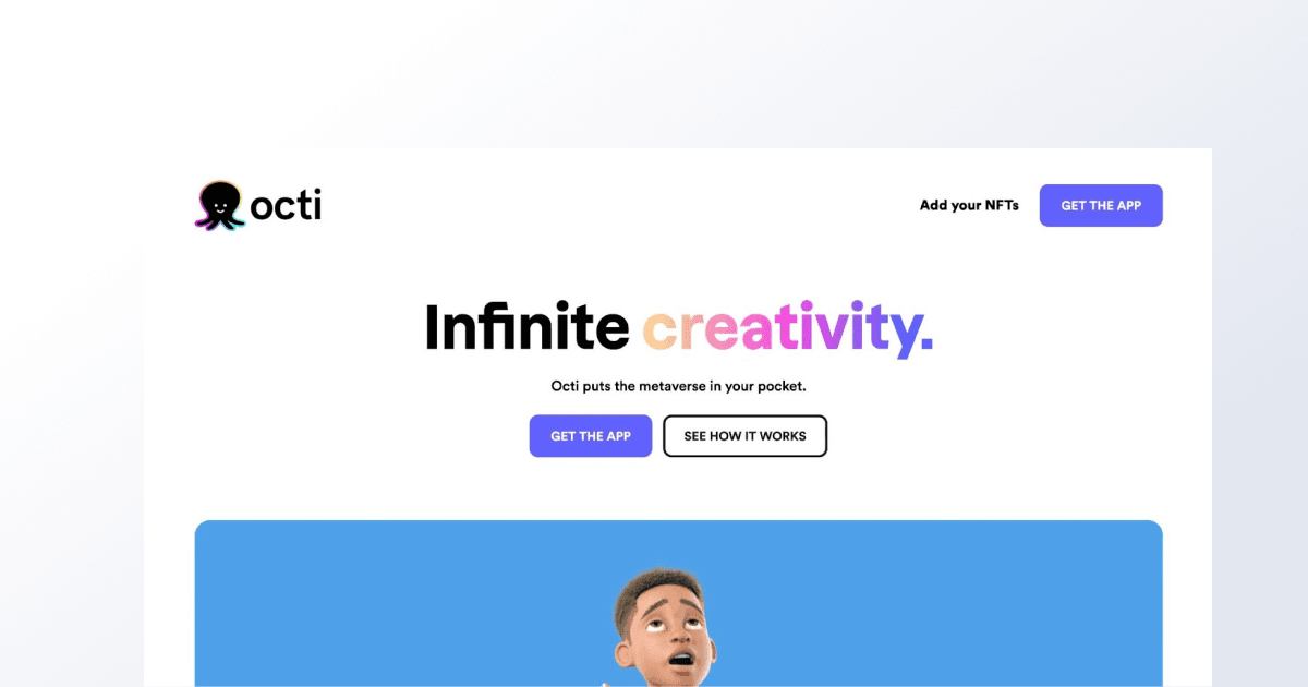
A one-page website is inherently simple. It allows you to deliver your message or showcase your products/services in a clear, concise manner. This can make your website more digestible and user-friendly, leading to increased engagement and conversion rates.
2. Focus:
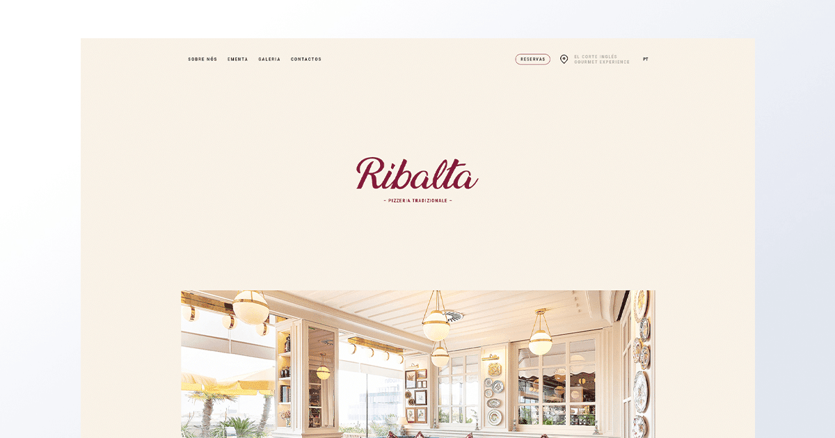
With a one-page website, you can hone in on a single product, service, or concept, keeping the user’s attention where you want it. This concentrated focus can make your offering more compelling and persuasive.
3. Ease of Maintenance:

Maintaining a one-page website is typically less time-consuming than managing a multipage site. This is especially beneficial for small businesses and individuals who may not have extensive resources for website maintenance.
4. Cost-Effective:

Building and hosting a one-page website can be more cost-effective compared to a larger website. This makes them a great option for startups, freelancers, or anyone on a tight budget.
5. Speed:

Given their simplicity, one-page websites often load faster than multi-page sites, especially if properly optimized. This can significantly improve user experience and boost your website’s performance in search engine rankings.
6. Ideal for Specific Purposes:

If you’re creating a portfolio, a landing page for a specific product, or a simple informational site, a one-page website could be the perfect fit. It provides just enough space to present necessary information without overwhelming your visitors.
7. Easy Navigation:
Scrolling through a single-page website is more straightforward and less confusing than navigating through multiple pages. This simplicity enhances user experience, making it easy for visitors to find what they’re looking for.
While single-page websites aren’t the perfect solution for every situation, they offer unique advantages that can help your brand or business stand out in the digital landscape. However, it’s crucial to carefully consider your specific needs and goals before choosing the one-page website model.
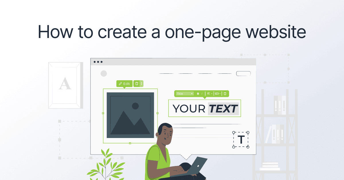
How to Create a One-page Website
Creating a one-page website may appear straightforward, but it requires a thoughtful approach to balance functionality, aesthetics, and content in a limited space.
Here are some steps to guide you in designing an effective and beautiful one-page website:
1. Define Your Goal:
Defining your goal is a foundational step when creating one-page sites. It’s setting the compass that guides your entire online presence. And it’s pretty simple too.
A good place to start is by asking yourself: What do you hope to achieve with your website?
This question clarifies your primary objective. Are you looking to captivate your audience with a compelling story? Generate leads and drive conversions? Or perhaps establish your personal brand as a thought leader? Defining your goal helps you stay focused and align every aspect of your one-page website with an intent.
Understanding your target audience is equally vital. Who are they? What do they seek? By gaining insight into their needs and desires, you can craft content that truly resonates and builds meaningful connections.

Defining your goal also helps you focus on what truly matters. With limited space, you must distill your message to its essence. That’s how you capture attention and guide visitors toward taking a desired action.
Then there’s how you measure success. You need to establish specific metrics that align with your objectives. Monitor conversion rates, engagement levels, or other key performance indicators. This data-driven approach allows you to refine and optimize your single-page site for ongoing success.
2. Plan Your Content:

One-page websites don’t have the luxury of space that multi-page websites have to explain what you do or offer, so your content must be concise, engaging, and clear. Create a content plan that covers all the necessary information without overwhelming your audience.
But by all means, get creative and think outside the box. Don’t settle for just presenting information – let’s tell a compelling story that grabs your audience’s attention. Weave together anecdotes, testimonials, and personal experiences to create a narrative that really connects with them on an emotional level.
And remember to add in some visuals. They can make a huge impact. Think striking imagery, interactive elements, and eye-catching infographics that bring your message to life in a visually appealing way.
You can also sprinkle in some surprises. For instance, you can tell your site visitors about hidden Easter eggs on your site or leverage interactive quizzes to keep them engaged and excited to explore more. These unexpected elements can leave a lasting impression and make your one-page site truly memorable.
Of course, it’s important to clearly communicate your unique value proposition. Showcasing testimonials and success stories will add credibility and demonstrate the real-world results you can deliver.
Ultimately, get to know your audience inside out and tailor your content to their needs, preferences, and aspirations. This personalized touch will make your single-page website feel like it was made just for them!
3. Design the Layout:
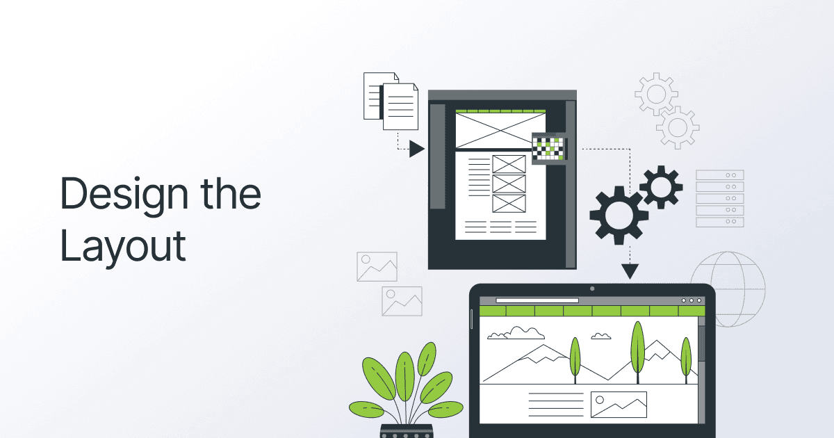
When it comes to designing the layout for one-page sites, there are a few important things to consider.
First off, you want to create a clear visual hierarchy that guides visitors through your content. This means using different font sizes, bold text, and colors to make important elements stand out, like catchy headlines or those all-important calls to action.
Breaking your content into distinct sections is another key factor. Think of it like organizing your thoughts into neat little boxes that visitors can easily navigate. Use clear headings and plenty of spacing to give your layout a clean and organized look.
You can also choose between a continuous scrolling page, where a user scrolls down to see more content, or anchor links that let them jump to specific sections. It all depends on the length of your content and the kind of user experience you want to create.
Leverage white space too. White space gives your content room to breathe and creates a clean, uncluttered design. So, leave some blank space around your elements.
Of course, your layout should also be responsive and look great on all devices, from big desktop screens to small mobile screens. And maintain a consistent visual identity throughout your webpage. That means using the same colors, fonts, and design elements that reflect your brand’s personality.
4. Prioritize Usability:

Usability refers to how easy and enjoyable it is for website visitors to use your site. It’s all about creating a smooth and hassle-free experience.
Usability ensures a seamless and user-friendly experience for your visitors. By focusing on usability, you make it easier for users to navigate, find information, and take desired actions on your website.
When it’s easy to navigate and understand the process, such as making a purchase or filling out a form, users are more likely to take the desired actions, meaning higher conversion rates and business success.
5. Choose the Right Platform:

Choosing the right platform means finding the one that best fits your specific needs. To do that, you’ll have to consider factors like ease of use, scalability, customization options, and support. Essentially, you want a platform that allows you to create a website or app that looks great, works smoothly, and can be easily updated in the future.
Depending on your coding skills, you may choose to build your website from scratch or use website builders like WordPress, Squarespace, or Limey. These platforms offer templates that can be easily customized to your needs.
If you’re skewing towards landing pages, try Limey out.
Getting results is what matters most, and that’s why Limey focuses on conversion optimization. We put in the legwork, running tests and digging deep into the research, just to make sure that the templates—from the layout to the design to the elements—are finely tuned to maximize the chances of visitors taking action. Be it making a purchase, signing up for a newsletter, or filling out a form.
Let’s know what you think once you’ve tried!
Remember, picking the wrong platform could lead to limitations, technical issues, or a difficult development process. But when you choose the right one, you’ll have a solid foundation to build upon, making it easier to create a successful digital project that meets your goals.
6. Optimize for Mobile:

With the increasing number of mobile users, it’s essential to ensure a seamless experience across devices.
Focus on responsive design, prioritizing essential content, and using mobile-friendly elements. Streamline navigation, minimize load times, and optimize images for faster mobile performance. By optimizing for mobile, you’ll provide a user-friendly experience that engages visitors and increases conversions on your one-page site.
7. SEO Is Still Important:
While one-page websites have limitations for search engine optimization, it’s still important to optimize your content. Use relevant keywords and meta tags and create a URL structure that’s search engine friendly.
8. Test and Launch:

Before you launch, test your website across different devices and browsers for compatibility issues. Look for broken links, load speed, and overall user experience.
Remember, the goal is to create an attractive one-page website that is not only beautiful but also serves its intended purpose effectively. It’s about optimizing the user experience within the confines of a single webpage, which, when done correctly, can lead to impressive engagement and conversion rates.
One-Page Site Examples for Inspiration
Websites don’t need to be intricate to make a lasting impression. In fact, effective single-page websites harmonize beautiful design, intuitive usability, and compelling messaging.
We’ve curated a handpicked selection of stellar examples of one-page sites that not only showcase their impeccable site structures but also serve as an inspiration for breathtaking design. Let’s take a peek:
Landing Pages
1. Andrew Baisden
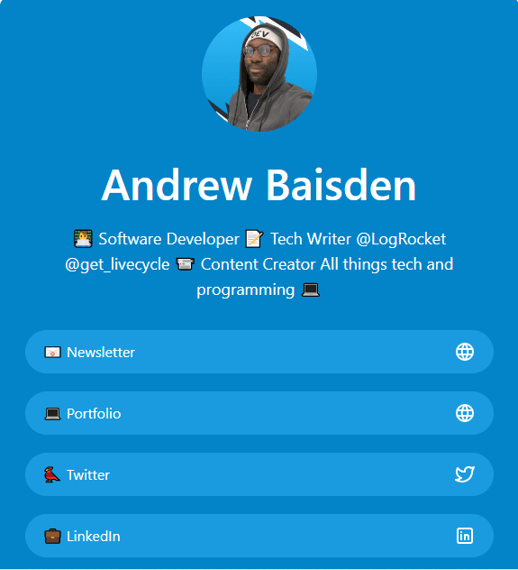
Andrew Baisden is a software engineer, writer, and maker based in London, England. His landing page on limey.io features a clean and straightforward design. It serves as a gateway to his various online platforms and resources. The page presents visitors with an easy-to-navigate layout that directs them to different sections of his online presence.
Upon landing on the page, visitors can quickly access Andrew’s newsletter, social media accounts, portfolio, and other relevant links. The simplicity of the design ensures a user-friendly experience, allowing visitors to find the information they seek effortlessly.
By providing these direct links, Andrew’s landing page acts as a centralized hub for individuals interested in learning more about his work. Visitors can explore his newsletter for the latest updates, follow him on social media platforms to stay engaged with his thoughts and activities, and access his portfolio to view his notable projects. All from a single page – no need for multiple pages when one gets the job done.
Although Andrew’s landing page doesn’t feature a split-screen design or a hamburger menu and other designs you’d typically find in multi-page websites, its simplicity and clear navigation contribute to an effective user experience. The page serves as a starting point for visitors to delve deeper into Andrew’s expertise, connecting them to the relevant content they desire.
2. Folasade Daini
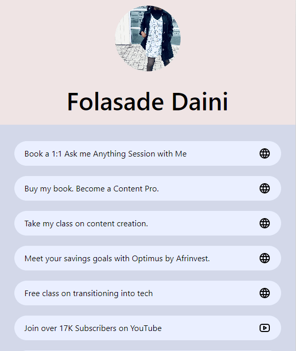
Folasade Daini’s one-page website is a centralized hub for Folasade’s online presence, offering visitors easy access to her various resources and services. She embraces a sleek and minimalist design that prioritizes delivering essential information in a visually captivating manner. With clear navigation options, visitors can effortlessly explore the specific offerings provided by Folasade.
One noteworthy offering featured on the page is Folasade’s “Class on Content Creation.” This unique opportunity grants individuals access to valuable insights and techniques for crafting compelling and engaging content with just a simple click. By generously sharing her expertise in this domain, Folasade empowers aspiring content creators to amplify their skills and achieve their goals.
However, the value Folasade offers can only be realized if visitors can easily navigate and access the relevant sections on her landing page. Choosing a one-page design template, such as those readily available on Limey, eliminates the risk of a disorganized site structure that might hinder visitor engagement. With an optimized layout, Folasade ensures that her visitors are effortlessly directed to the information they seek, ultimately enhancing their overall user experience.
By utilizing Limey’s ready-made templates, Folasade Daini’s landing page creates a seamless and enjoyable journey for visitors, directing them precisely to the resources they need. This streamlined approach ensures that visitors can fully appreciate and benefit from the value Folasade provides.
3. HTML All the things

This landing page is a simple, yet highly functional, hub that offers visitors a convenient and efficient way to access various links. Its minimalist design and intuitive layout make it a great landing page, emphasizing ease of use and providing visitors with a seamless browsing experience.
The interface is clean and uncluttered. The absence of unnecessary distractions allows visitors to focus on the page’s primary purpose: accessing relevant links quickly and effortlessly.
Rather than navigating multiple pages or performing extensive searches, visitors can find information by simply tapping on the available links. The landing page serves as a centralized hub, providing access to a range of resources and destinations relevant to HTML All The Things.
The structured layout of the page eliminates confusion and ensures that users can swiftly navigate through the various destinations without unnecessary obstacles. This landing page exemplifies efficiency and functionality. It’s an excellent website design, especially if your users value time-saving and hassle-free browsing experiences. Who doesn’t?
Single-Page Web Designs
4. Musab Hassan
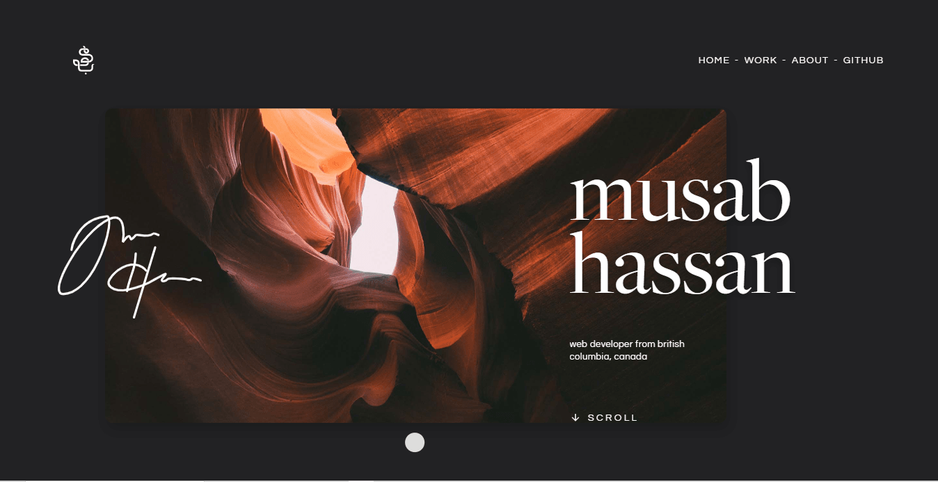
Musab has cleverly designed his site with a split-screen layout. On the left side, there’s a hamburger menu that lets you jump to different sections of the site. Meanwhile, the right side showcases eye-catching images with subtle animations.
Instead of opening separate pages, the menu items take you directly to the relevant section on the same page. Musab keeps things simple yet effective in his portfolio. You can easily find important details like contact information and samples of his work.
He doesn’t overwhelm the site with all his past projects but rather focuses on highlighting a few top projects that leave a lasting impression.
Just a click moves you around the one-page layout without sacrificing aesthetics. This way, you give site visitors exactly what they need and even win potential customers in the long run.
5. Balsoy
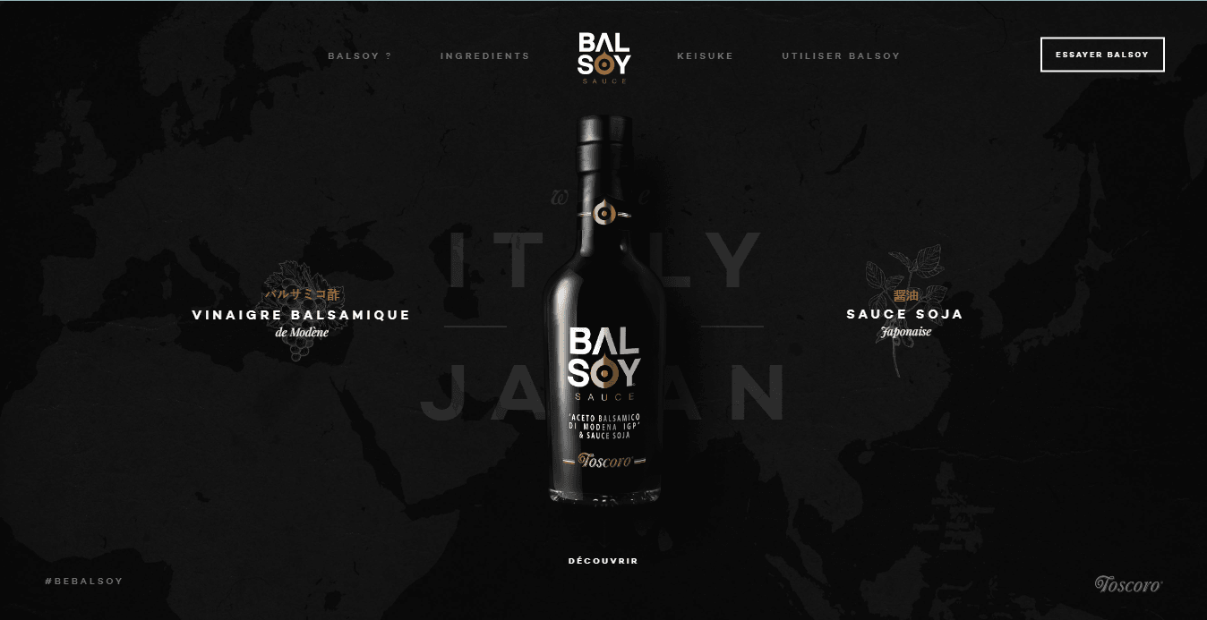
Balsoy is an ingenious fusion of balsamic vinegar and soy sauce, nestled within a sleek one-page website. This masterpiece exemplifies how a company can effectively promote a single flagship product.
When you visit the Balsoy website, you’re in for a treat. It’s interactive and fun. You’ll see a cool video playing in the background, and there are buttons you can click to take you to various pages in the one-page design. For example, you can learn what ingredients they use to make Balsoy, and you can even learn about the chef who came up with this amazing sauce.
They also have a section where they share yummy recipes that go perfectly with Balsoy. If you see a picture of a dish you like, you can click on it and get more information on how to use Balsoy to make that specific meal taste even more delicious.
You can take inspiration from Balsoy’s website for your online store. This way, you put all the important info about your product on one page, connect them with anchor links, and make it look awesome with cool animations, videos, a photo gallery, and other media elements. That’s how to increase user engagement and convert potential customers.
6. Eggshell

This is a simple website without a lot of text. Instead, it has an image gallery of different brands Eggshell has worked with. If you want to know more about a specific project, you can click on the brand’s logo.
It’s a simple single-page design you can create using any drag-and-drop builder or even any AI website builder. This type of web design is useful for people who work in visual industries such as graphic design or photography. Essentially, this is a great design for creative agencies, or for your own website to showcase a creative portfolio or personal project.
All you need is a photo gallery that represents your projects. Instead of having to hire a web designer with extensive coding knowledge, you can simply use a website builder they usually have a one-page website template like this), drag and drop a few things around, add your custom domain, and voilà!
You have an amazing website for yourself.
Conclusion
The allure of a one-page website lies in its elegant simplicity, focused content, and easy navigation, making it a powerful tool for individuals and businesses alike. From showcasing portfolios to promoting a single product or event, the potential applications are vast and varied.
However, the success of a one-page website ultimately hinges on thoughtful design, compelling content, and a seamless user experience.
If you’re inspired to start your journey toward creating an attractive one-page website, Limey is your perfect companion. With our platform, you can craft a stunning single-page site in just a matter of minutes, thanks to our ready-to-use templates tailored to a variety of needs.
Not only do Limey websites embody aesthetics and functionality, but they are also SEO-friendly, helping you increase your visibility on search engines. Plus, our websites promise blazing-fast loading times, keeping your visitors engaged and satisfied.
The beauty of a one-page website lies in its ability to present your brand story in a neat, single-scroll narrative, creating a powerful and memorable impression. As you embark on this exciting journey, let Limey be your trusted partner, turning your vision into a compelling digital reality.
Take the first step towards creating your stunning one-page website with Limey today!
Frequently Asked Questions
A one-page website, as the name suggests, is a website that contains all its content on a single page. Instead of clicking on different pages, users scroll down or across to access various sections of the website.
A one-page website offers simplicity, focus, and ease of navigation, making it an excellent choice for showcasing portfolios, promoting events, presenting personal resumes, or focusing on a single product or service. They are also typically faster and mor
Yes, you can still apply SEO techniques to a one-page website. This includes using keywords appropriately, ensuring your website loads quickly, and making your website mobile-friendly. Limey's one-page websites are designed to be SEO-friendly, helping to
Yes, one-page websites can be designed to be fully responsive and mobile-friendly. Limey's platform ensures that all our one-page website templates are optimized for various screen sizes, providing an excellent user experience on all devices.
Limey provides a user-friendly platform to build beautiful one-page websites in a matter of minutes. We offer a variety of customizable templates, and our websites are SEO-friendly and boast impressive loading speeds.
A one-page website can be an excellent choice for many businesses, particularly those looking to showcase a single product, service, or portfolio. However, it's essential to consider your specific business needs, goals, and the amount of content you have
Share
Related posts
More PostsStay in the loop.
Get notified when we release a new feature or blog post.
